Nonprofits, like every other organization and business, depend heavily on a website to communicate their message, to reach volunteers and donors, and to present the organization in a professional and inspirational manner online. This website has a big responsibility, yet nonprofits are short on funds, and unfortunately tend to set aside very few funds for a web budget, if they have one at all. However, there are ways to achieve a quality web presence without a significant budget. In this article, 10 Expert Tips for Best Nonprofit Web Design, we will explore how.
First things first, the organization needs a website and it needs to be found in a good search, which means it needs strong SEO (search engine optimization) so when a potential donor searches for their interest, this nonprofit pops up in a search.
Search Engine Optimization strength is best achieved with a self-hosted site, so it is best to not use free options such as Squarespace, Wix, even WordPress.com. Self-hosting can be achieved by hiring a professional nonprofit web developer or by launching it yourself following this DIY WordPress for Nonprofits tutorial.
Now that you have a website, if you apply the following tips, you will be well on your way to a nonprofit website that will work for you.
1. Make Sure Your Design Enhances Your Nonprofit’s Mission:
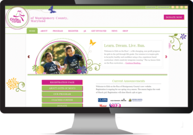
You have mere seconds to appeal to a visitor and so design and scannable content is key, especially on the home page, though keep in mind people can enter your site from inside pages as well. The design needs to enhance or showcase your mission, not be front and center. Current design trends are toward lots of white space, large full screen images, and an easy mobile visit. Titles of excerpts and pages should be short and clear, carrying your message succinctly.
This Girls on the Run site here does an excellent job with a minimalist design that also showcases their mission:
2. Your Mission and Background Clearly Stated:
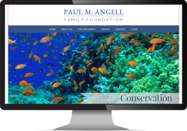
Why does this nonprofit exist? Who are you helping? How did it start? These questions should be answer, albeit briefly, above the fold, on the home page, as well as inside pages. Sometimes you can give visitors fast insight with a combination of your logo, homepage image, and overlaid text like this nonprofit, The Paul M. Angell Family Foundation :
3. Draw Your Visitor in with High Quality Images and Personal Stories:
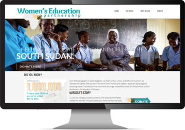
Once you have your visitor intrigued with your home page, draw them in with personal stories and high-quality images about who you help. Like WEP-us.org does, talking about Marissa’s story right on the home page, with links to longer stories on inside pages. With personal stories, faces and names attached, donors can feel something for your cause. Read Marissa’s story and see what you think:
4. You Need to Speak to Three Audiences:
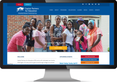
Beware as you create segments of your site, you need to appeal to three audiences: Those who need an introduction to your cause, those who will support you via donations and volunteering, and those who you help. Try to have a boxed excerpt on the home page that actually appeals to each audience. The article will jump inside to its own page where the ideas are expanded, and collateraol can be found such as download-able brochures and/or donation or volunteering forms, or contact forms offering more information for those who seek to learn about your cause. This nonprofit, Capital Partners for Education, does a great job reaching all audiences, with areas that clearly state their mission of providing academic support for low-income students, as well as ways for students to sign up including mobile event sign-up, online event registration, and robust volunteer sign-up and donation capabilities for those who want to help:
5. Give Multiple Ways to Contact You
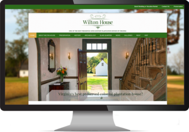
Of course this may seem obvious, but the ways you offer contact may depend on your audience – an older audience may surely need a telephone number, the younger audiences would lean on social media and everyone welcomes a contact form and an email sign up option is a great way to continue and build relationships with visitors. To allow visitors to feel secure and comfortable contacting you, a physical address with a link to Google maps lends authenticity to your site, something Google search engines also welcome, and respond by being more likely to serve up your site in a search for your mission. This nonprofit , Wilton House Museum, provides multiple ways for interested parties to reach them, and does a good job addressing the wide age range in their audience.
6. Clear and Easy to Navigation Donation Forms and Volunteer Sign Up is Crucial:
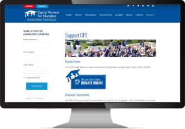
Obvious again, but so often made complex or, worse, hidden. The organization that does a star-studded job serving up easy and multiple ways for visitors to donate or volunteer is Capital Partners for Education. They offer several ways to donate on their support page here, which is also accessible from several different links in their banner, footer and sidebars, and often referred to through out their site. People want to help you, help them help you! Don’t put only one button to donation or volunteering options, put them in several places. People view web pages differently – some might look up, some down, some might need color to actually spot the button. Visit Cpfe.org here and see how they handle this.
Do you want help re-defining these areas of your nonprofit site perhaps with adjustments to the pages, navigation, some copywriting, addition of a form? Contact us using this form and let’s see what we can do for your nonprofit website to make it work as hard as it ought to for you and your organization.


